Kolkata has caught on to the hotdog phenomenon. Call ’em sausages, weiners, franks or what you may, these meat sticks in buns are clearly the next big thing in the fast food category in the city. The Keventer Group was quick to catch on. And along with them, their design & communication partners for the said project, Studio Red.
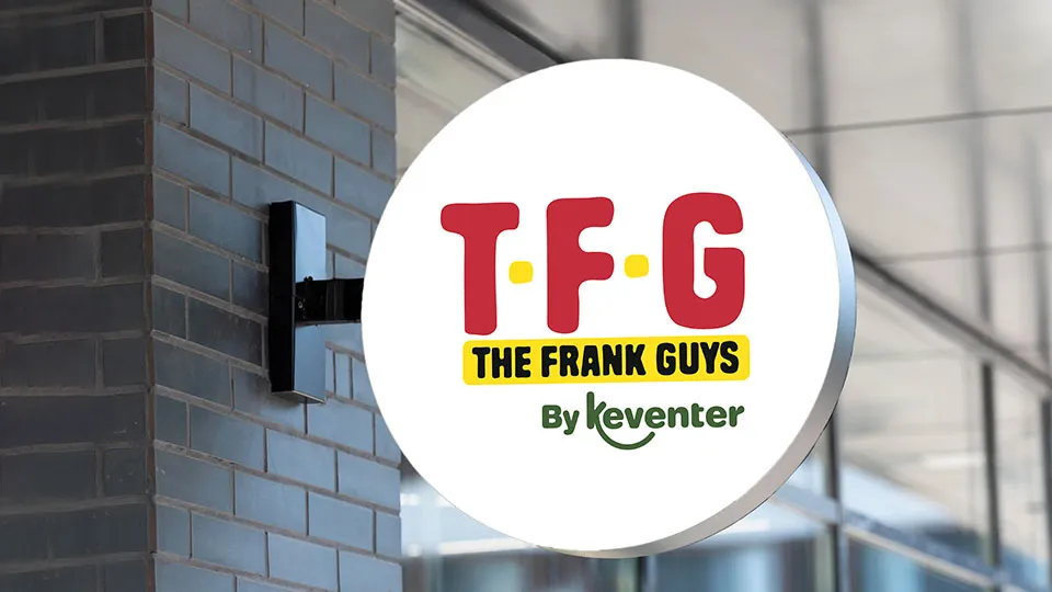
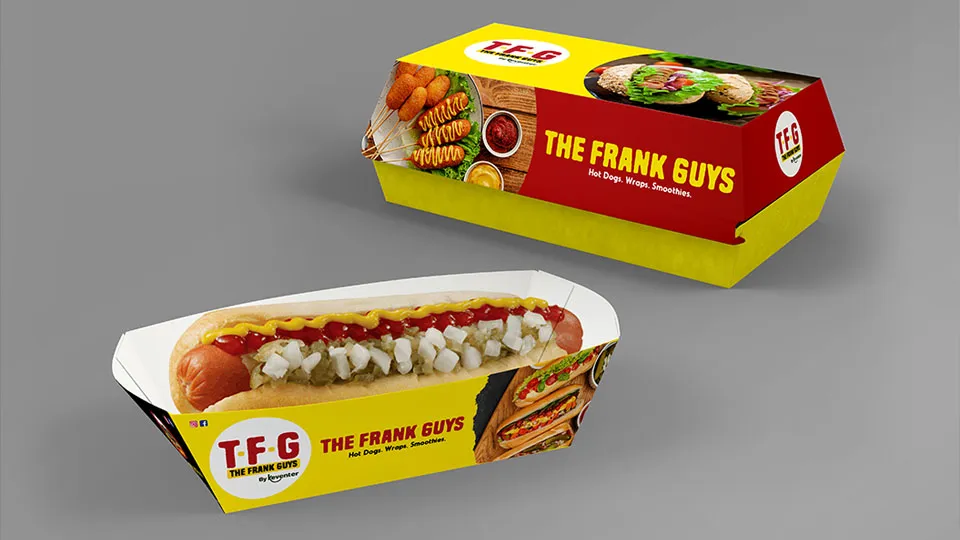
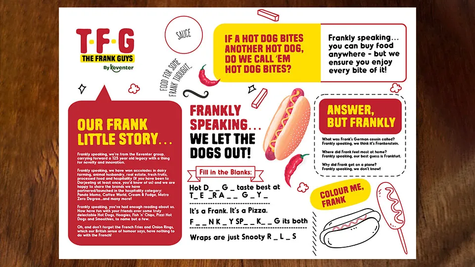
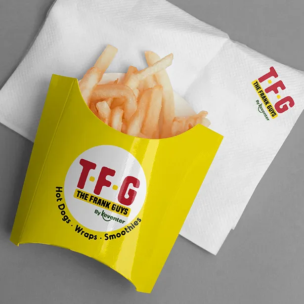
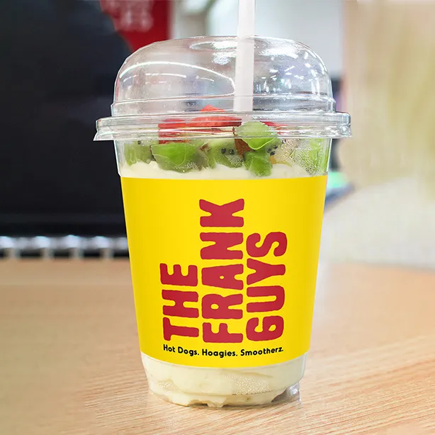
As Keventer got the business plan approved, it needed a name. A name that would ooze hotdogs, as well as the fact that these guys were the hotdog specialists. We whipped up ‘The Frank Guys’ and worked on a logo and persona that would definitely grab eyeballs.
DATE: 2021
CLIENT: The Frank Guys
INDUSTRY: FMCG
WEBSITE: www.thefrankguys.com
Unique challenges
call for unusual
solutions
The Challenge
The challenge here was a unique one. Like it or not, the sausage shares its connotation with well… Keeping that into consideration, Studio Red started writing out names. Some coined, some radically new – all challenging convention.
The Approach
A gazillion names later, Keventer approved of The Frank Guys. It gave them a higher ground, as well as veered away from the urban slang. The logo design, in line with the fact that hot dogs are a hot bunch, turned out to be a glorious combo of red and mustard.
Frankly speaking, this one rocked enough
to feature in our case studies.
We are very happy with Studio Red's turn around time and willingness to complete projects based on client timelines.
Sanjay Dua
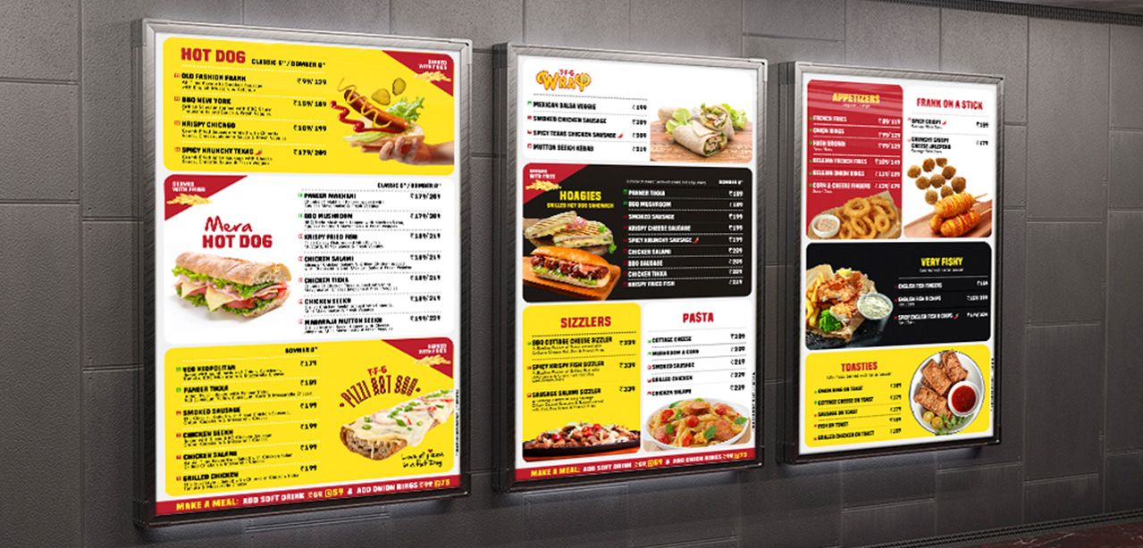
Menu
Studio Red began in 2010 with a simple vision – to provide support to businesses with great designs.
We believed in the professionalism of a big agency, yet worked with the flexibility of a small unit and this helped us go from strength to strength.
At the agency, we completely believe in bringing the extra out of the ordinary. We love brands and all things design.
We enjoy the little things in life and always put our best foot forward.
Today, with our experience as a mainline agency, we have achieved various milestones for our clients, churning out regional and national ad campaigns for Start-ups, SMEs and Corporates. As a digital marketing service provider, we have provided comprehensive solutions across Branding, Social Media Marketing, Websites & E-Commerce – a 360 degree gamut, quite literally.
We looked at the pandemic in the eye and came out stronger – with partnerships and collaborations that propelled us further.
Today, Studio Red is led by two women entrepreneurs and a team across the country that provides local, regional and national context to the work that we do.
What has helped us retain our clients is the fact that we understand their business inside out – an attribute that has helped us create communication that has touched a chord with their audiences and has struck gold. Our go-to-market approach and a deep understanding of how-stuff-works set us apart from the other design shops. Our extensive experience covers industries like IT, Realty, Healthcare, FMCG, Entertainment & Hospitality, to name a few.
Whether it is a Start-Up who wishes to acquire its first 100 clients faster, or a Corporate who wants to strengthen market presence, our team has the ability to be a partner in growth.