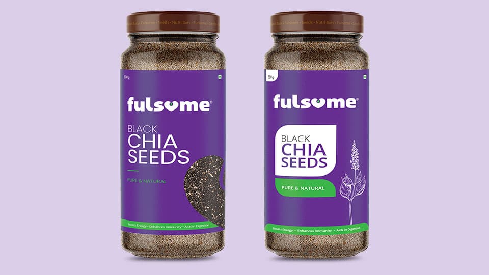
The premium Karnataka based seed manufacturer Fulsome had an interesting brief for us. Create an identity that would be synonymous with the honest, earthy efforts of those who cultivate and culture them. Not interesting enough? Now read this. The identity had to be such that it could be easily engraved on a chocolate, as well as on normal packaging.
That’s what got us at Studio Red thinking. Fundamentally, the form had to be incredibly simple but the effort needed to be visible. We went to our drawing boards with the understanding of human psychology on top of our minds.
DATE: 2021
CLIENT: The Frank Guys
INDUSTRY: FMCG
WEBSITE: www.thefrankguys.com
An age-old
hygiene revisited
The Challenge
This was one client who wanted to be involved in every stage across the identity exercise, which is why we decided to revive the rarely used hygiene of displaying hand-drawn dev sketches for approvals, a la, 1960s-70s advertising style.
The Approach
Three among the innumerable logos created were shortlisted for further development. Extensions like stationery and packaging were developed for each and when the final logo that you see now, hit the shelves, we were ecstatic. Talk about the labour of love, this.
Lorem ipsum dolor sit amet, consectetur adipiscing elit, sed do eiusmod tempor incididunt ut labore et dolore magna aliqua. Quis ipsum suspendisse ultrices gravida. Risus commodo viverra maecenas accumsan lacus vel facilisis.
Name
Co-Founder
Menu
Studio Red began in 2010 with a simple vision – to provide support to businesses with great designs.
We believed in the professionalism of a big agency, yet worked with the flexibility of a small unit and this helped us go from strength to strength.
At the agency, we completely believe in bringing the extra out of the ordinary. We love brands and all things design.
We enjoy the little things in life and always put our best foot forward.
Today, with our experience as a mainline agency, we have achieved various milestones for our clients, churning out regional and national ad campaigns for Start-ups, SMEs and Corporates. As a digital marketing service provider, we have provided comprehensive solutions across Branding, Social Media Marketing, Websites & E-Commerce – a 360 degree gamut, quite literally.
We looked at the pandemic in the eye and came out stronger – with partnerships and collaborations that propelled us further.
Today, Studio Red is led by two women entrepreneurs and a team across the country that provides local, regional and national context to the work that we do.
What has helped us retain our clients is the fact that we understand their business inside out – an attribute that has helped us create communication that has touched a chord with their audiences and has struck gold. Our go-to-market approach and a deep understanding of how-stuff-works set us apart from the other design shops. Our extensive experience covers industries like IT, Realty, Healthcare, FMCG, Entertainment & Hospitality, to name a few.
Whether it is a Start-Up who wishes to acquire its first 100 clients faster, or a Corporate who wants to strengthen market presence, our team has the ability to be a partner in growth.